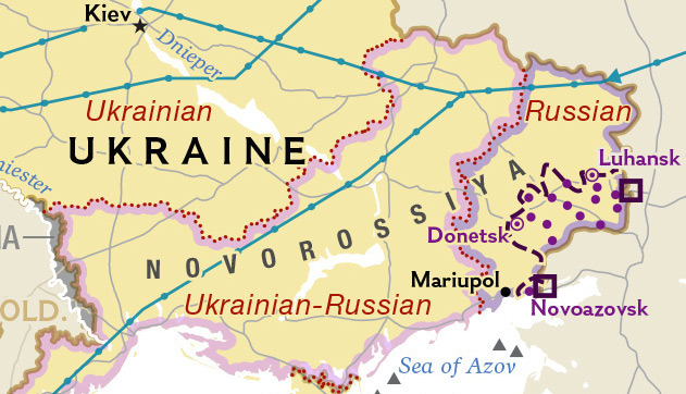
National Geographic recently published a map on their online publication showing Ukraine not only divided along what it portrayed as very obvious and cutting divisions, but also giving topographical legitimacy to the Russian colonial term "Novorossiya," mixing fantasy with reality.
When this map went public, our comments were filled with complaints, with readers blown away that such a major, international news source would make such a gaffe in their map making. The National Geographic Society previously made claims that it would shade in grey "disputed" territory when it recognized Russia's occupation of Crimea, but that rule didn't apply in this case.
Here's why this map was wrong:
Language
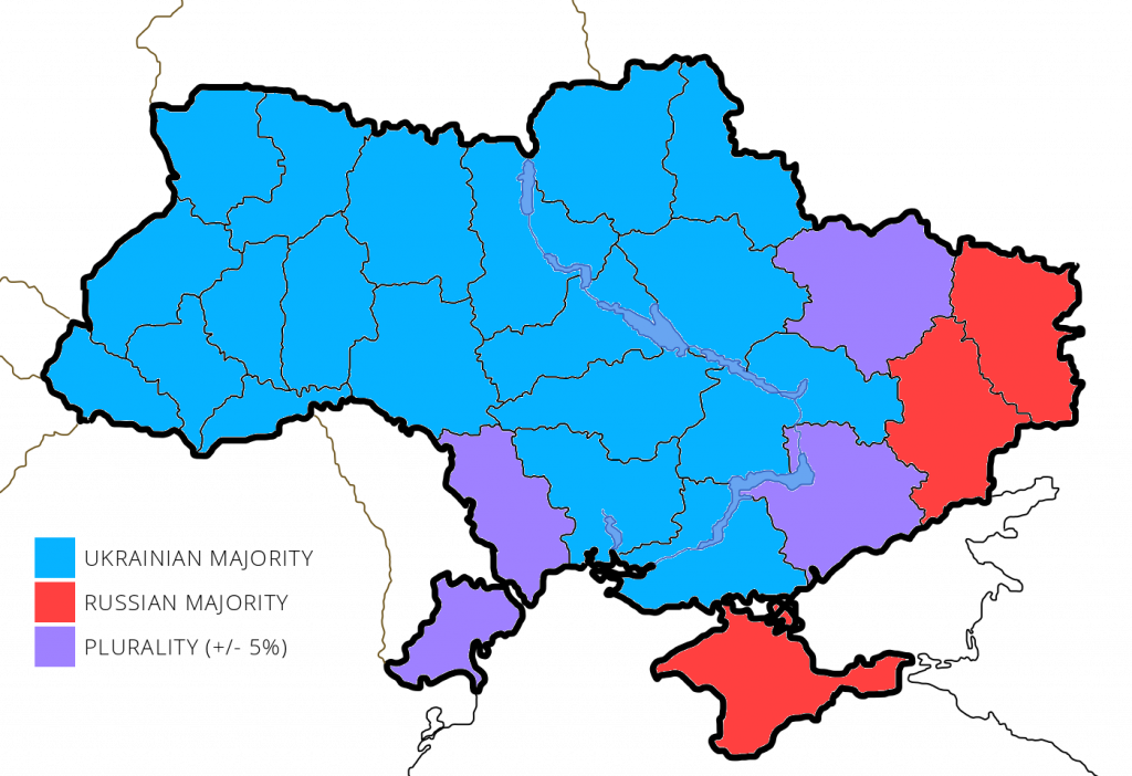
The following two maps show the real linguistic situation in Ukraine. While many in Ukraine are bilingual, in both the east and the west, native tongue is an important form of ethnolinguistic affiliation. Here we can see that the idea of a "Ukrainian-Russian" plurality among all of eastern Ukraine doesn't pan out, with only Kharkiv, Zaporizhzhia, and Odesa oblasts having real parity.

But Donetsk and Luhansk oblasts are still "Russian", that is, until you break down map by district and not gerrymander it by region:

Instead, the areas with a majority of native Russian speakers correspond more closely to the Anti-Terrorist Operation (ATO) zone now occupied by Russia, nearly exactly.
Protests
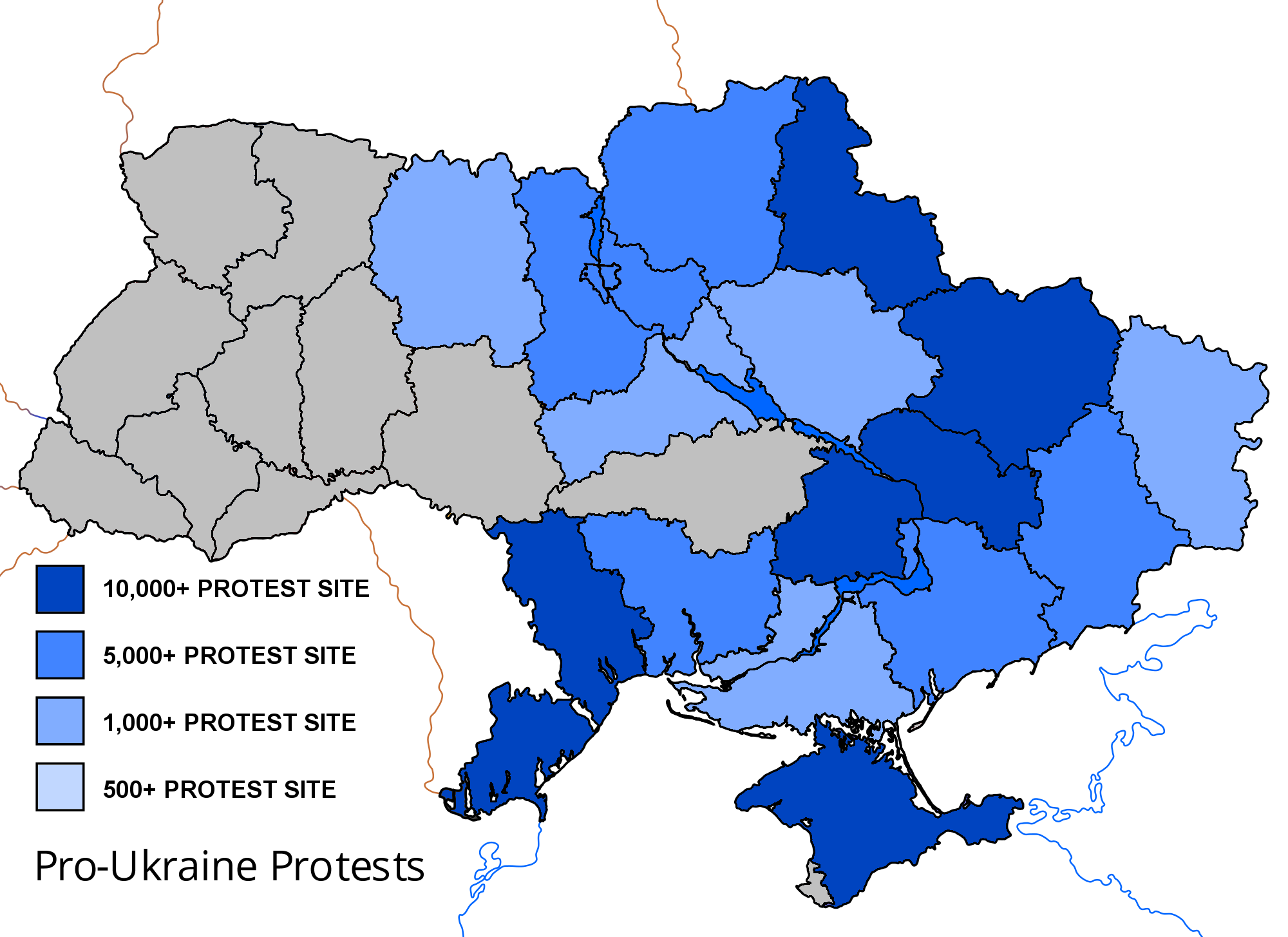
Another issue with National Geographic's map is that it demarcated the entire south-east of Ukraine as being involved in pro-Russian protests. While many of these regions saw protests, they were often isolated to the capitals, small in number (especially when compared to the mass Euromaidan protests in Kyiv), and sporadic. In many cases these protests would happen on a weekend and never be seen from again, or drop considerably in number after the border with Russia was closed.
Further, the isolated protest in Kherson was so small we had to omit it from the map altogether as it did not meet our cutoff of 500 persons.
What National Geographic's definition of pro-Russian protests also omits is that concurrent to these rallies were also a wave of pro-Ukraine unity counter-protests, which covered a large area of the country, and in many cases dwarfed their Russian counterparts. (note: this map does not include all western Ukrainian pro-Ukraine rallies, and focused only on areas outside of the very pro-Ukrainian west.)
Now, let's look at the before and after of the Nat Geo map gaffe, which has since been mildly corrected:
As you can see, while they have removed the dotted-red line that indicated the "most common language," the indicators of "Ukrainian," "Ukrainian-Russian," and "Russian" are still not telling the true story. They did, however, demote "Novorossiya" from a bold black font to a light grey, adding "Historical region" in parenthesis.
National Geographic is not the only publication guilty of simplifying Ukraine's narrative into two equally opposed halves. Binary concepts are easy to digest and easy to explain to readers. Clean lines are easy to understand and equal halves give parity. But it's oversimplification that leads to distortion, and this was the case with National Geographic. Although demoting "Novorossiya" is an improvement in removing fantasy, they do need to issue another correction on the language and protest reality on the ground.


