There is no denying that your brand's logo is quite literally the first impression anyone has of your brand, and hence, as we say, making the first impression right is significant. So, how should you do this?
Well, while your overall logo should be great, the color of your logo is a crucial factor in not only conveying your brand’s message but also in whether a customer approaches you. Hence, choosing the right colors is essential.
For this, you need to understand the psychology of colors and how it benefits you, rather than just guessing your way through the design. Want to know how to pick colors for your logo based on color psychology, along with the best online logo maker? This guide has you covered.
Understanding the color psychology
Growing up, we often thought of red as anger and blue as calm. Why is that? This is because we link each color with a feeling and emotion, and that is actually what color psychology is.
Color psychology is basically the study of how different colors affect human emotions and perceptions. Each color can bring out a particular response and feeling from a human. Brands, hence, can benefit from the relation between colors and the associated feelings to connect with their audience on an emotional level.
Once a brand grasps the psychology, it can use specific shades to mirror its personality. This alignment is what actually connects with the audience.
Common logo colors & what they mean
Now that you understand the psychology, let's break down the emotional spectrum and how you can create logos like an Instagram logo maker. Below, we have listed down for you some of the standard logo colors which you can use, and what emotion each of these colors represents:
![]()
-
Red: Passion and alertness
Red is fiery hot and delivers a sense of passion and rush. This is why brands like Ferrari have used this particular color as their main choice so that fans can feel the same surge of passion when they see the logo as they do when they see their cars racing around in the circuit. Red requires discipline.
-
Orange: Vibrant and energetic
Next up on our list is orange, carrying its vibrant energy. It gives off a playful, energetic charm and carries youthful energy.
Look at Nickelodeon. It is the definitive example of this energy. If you want to inject a refreshing burst of life into your brand, this color is the move.
-
Blue: Trust and calm
Blue is the eternal standard for stability. It represents deep serenity and tranquility, acting as the visual anchor for any brand that needs to project absolute calm. Water is a better example than the sea. The large body of water, with its glistening shade of blue, brings out a feeling of calm unlike anything else. However, when it comes to brand logo representation, the Facebook logo conveys a sense of responsibility that always tops our list.
-
Yellow: Clear and optimistic
With its mental clarity and optimistic approach, everything seems like sunshine and rainbows with the color yellow. This shade is about warmth and home, and Ikea and McDonald's are two very strong examples of this.
How to choose the right color for your brand?
Selecting a color is a strategic decision, not a matter of taste. If you pick a palette just because it looks good, you are ignoring the market. Weigh these factors before you commit to an identity.
-
Identify your brand personality
Defining the personality is step one. Decide if you are aiming for peace or energy before you build the visuals. Your color choice would help you reflect that particular characteristic and will make people instantly resonate with your targeted feeling.
-
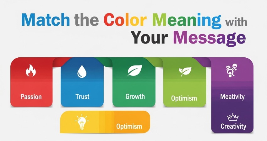
Match the color meaning with your message
As mentioned above, every color has its own meaning. Therefore, it is essential to understand the message that you want your brand to give out and to apply the right colors according to it. An appealing logo with the right colors will not only support your message but also build customer trust.
-
Look at industry expectations
There are many industries in which most brands use the same specific color. This represents a sense of familiarity and reliability among their consumers. Hence, as a business or brand new to the industry, you must study your competitors well and see what color might work in your niche.
X-Design – your one-stop shop to generate the best logos
Now that you have understood color psychology and how to choose your brand colors, it is essential to know where to use them. What do we mean? Well, we are talking about finding the perfect platform to generate your logo, with the ideal colors, too.
In our view, X-Design remains the superior choice. While other tools force you to assemble generic shapes manually, this platform takes a more direct approach. You simply input your vision—describing the mood, the style, and the core identity—and the system instantly translates that description into a polished visual asset.
You aren't left waiting on a designer or struggling with complex software. You get professional concepts ready for immediate use. It bridges the gap between a raw idea and a finished file. A frustrating afternoon becomes a five-minute job.
Wrapping up!
Finding the perfect color is worthless if you can't execute the design. Theory requires a vehicle. This is where X-Design enters the workflow. It bridges the gap between abstract strategy and a finished asset. You don't need to master complex software to apply these rules. The platform acts as a creative partner, ensuring your color choices translate into a mark that is distinct and professional. Don't just select a palette; build an identity that actually delivers.