Once upon a time, a blurry picture was a subpar picture. Now? It's a marketing masterpiece. In the era of über-sharp pixels and über-polished visuals, brands are realizing that the key to separating themselves from the pack isn't perfection — it's error. The grain of noise, the distortion of compression, the shake of a digital glitch — all of it is cool again.
It's where techniques like Pippit's low quality image maker come into play. It's not about concealing imperfections anymore; it's about engineering them. The beauty of faultiness is now a visual vocabulary all its own — one that communicates nostalgia, candor, and humanity.
We live in an age where intentional "flaws" are more desirable than flawless images — because they're perceived as real.

When the glitch was the objective
There was a day when pixelation, noise, and blur were avoided at all costs by designers. Nowadays, they pay extra to achieve them. A glitch is no longer an accident, but an act of aesthetic rebellion. It is evidence that digital can still be soulful.
You've encountered this everywhere: streaking text on displayed ads, warped movements in reels, or fragmented images glazed over as if they were on a VHS tape. These oddities disrupt the sameness of perfect feeds and presented brands. They represent uniqueness in a time of templates.
It's the same reason film cameras are popular again — not for accuracy, but for unpredictability. A little blur or burn is alive. In marketing, that aliveness has proven priceless.
The psychology of imperfection
Perfection is scary. It is corporate, removed, unattainable. But imperfection — that's where personality exists. When individuals look at a brand and see that it condones chaos, they unconsciously see personality.
A slightly distorted image says, "We're human too." A glitched frame appears spontaneous. A blurred ad feels nostalgic. These little creative "mistakes" evoke emotional memory — that cozy sense of old TV screens, dial-up internet, or original digital cameras.
Among a ocean of perfect AI renderings, these imperfect images whisper something else: We remember where it all started.
Making digital decay into design
Let's be clear — this's not sloppy. The design of visual imperfection is highly intentional. Designers are learning to use error as a paintbrush: using compression, saturation, and blur to create specific moods.
Want to make a campaign that appears to have been scanned from a retro magazine? Add a grain. Want your campaign to be cyberpunk and anti-establishment? Add a glitch trail. Want it to be warm and fuzzy? Blur the borders.
What I love about new tools like Pippit is that it makes these textures easy to manage — you can tune chaos to perfection. Every "imperfection" is now a design choice.
The revolution against perfection
Brands used to link success straight to that polished look. Now they tie it more to personality. The anti-perfect style is really catching on. Audiences want honesty, pretty much. Scroll through TikTok or Instagram sometimes. The viral stuff usually comes off spontaneously. Shaky in spots. Unfiltered all the way.
The cultural pivot is evident — perfection doesn't convince anymore. It isolates. In reaction, marketers are reclaiming the beauty of flaws. Compression artifacts, over-saturated colors, even low-res text — all those previously unwelcome details now act as emotional triggers that make a brand stand out.
They're not flaws now; they're fingerprints.
Mixing imperfection with fearless creativity
A creative spin on this trend is the blending of digital degradation with street-art vibrancy. Pixel blur and glitch lines are being merged with raw typography and graffiti-style overlays. With tools such as Pippit's online graffiti generator, you can blend lo-fi imperfection with emotive lettering to produce visuals that appear gritty, rough, and dynamic.
This style crosses over two worlds — the analog chaos of early internet art and the gritty reality of urban architecture. It's a style that registers as both retro and militantly contemporary.
From mistake to message: the Pippit technique
The next time your picture turns out too blurry or over-compressed, don't erase it — design with it. Pippit simplifies making those flaws into narrative devices. With its user-friendly editing platform, you're able to manage blur, texture, and distortion with precision, making every "error" a visual metaphor.
Here's how you can make your own intentional flaw with Pippit:
Step 1: Add a photo
First, go to the Image Studio option from the main dashboard, then access the editor by clicking on Image Editor. Click the Upload option to search and choose the image you wish to edit from your device, or just drag and drop it into the editor window.

Step 2: Turn your image in low quality
Now it's time to degrade images to low quality accurately. In the editor, find Effects in the left menu, and click Blur > Low quality. With the Intensity slider, adjust exactly how pixelated or compressed you want your image to look — slide to 100 for complete degradation.

Step 3: Export your result
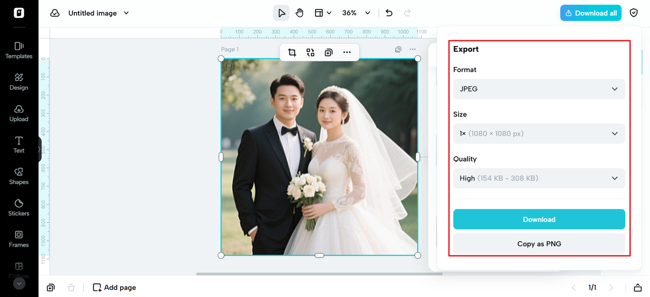
Click the "Download all" button in the upper-right corner of the editing interface if you're happy with the way your edited image looks. Click Download after selecting low quality and your preferred file format in the download dialogue box. You can now use the low-quality image you just made!

Emotional design via visual deterioration
There's a reason why viewers are attracted to bugs. They are manifestations of vulnerability in an otherwise perfect system — a reminder that technology also has a pulse. As applied to narrative, that vulnerability can be potent. A bug in a brand video could represent upheaval. A blur could represent memory. A shattered gradient could represent time.
It's a form of electronic poetry: flaws that reveal greater truths. Marketers are starting to realize that emotional connection comes not from technical accuracy, but from creative truth.
Where poor quality turns into good narrative
Clarity is usually paramount in advertising — but occasionally, distortion speaks louder. By blurring a picture or leaving compression lines visible, you pique interest. People lean in and try to make sense of what they can't quite see. That involvement — that thinking along — creates connection.
This is what "bad quality" is all about nowadays in marketing language: not failure, but interestingness. It's the way you make an image felt, not just looked.
Imperfection as luxury
Ironically, in an era of digitally green-screened worlds filled with neat AI renderings and perfectly composed brand imagery, actual imperfection is scarce — and thus precious. A grainy photo may appear more authentic than a $10,000 campaign photo shot in 8K. Viewers believe what feels lived-in.
Advertisers are starting to view "flawed" content as a reward rather than a risk. It's the graphics counterpart of a handwritten autograph: evidence that a genuine human being is creating pixels.
Pippit: Where your failures are masterpieces
Pippit is not just some regular image editor. It is more like a playground where you can break all the creative rules. You might be making visuals for a campaign or digital art. Or maybe nostalgic posters. Pippit's toolkit lets you efficiently design those imperfections. They end up feeling intentional. And artistic too.
You do not have to hide your creative mistakes anymore. Start celebrating them instead. Add some blur. Amplify the grain a bit. Exaggerate that compression. Then your visuals can breathe with real emotion again.
Use Pippit now, and make your so-called "mistakes" the sort of art that resonates, captivates, and sells. Because in the marketing landscape today, imperfection is not failure — it's flair.